|
|
Charts and Graphs A small collection of trend plots that are ready to include in your term paper! I get annual recharge and discharge totals from reports produced by the EAA, and sometimes they are not available until long after a year is done. For example, 2024 numbers may became available in early 2026. If you prefer, you can view the actual numeric data. For a chart showing J-17 index well levels, see the J-17 page. |
|
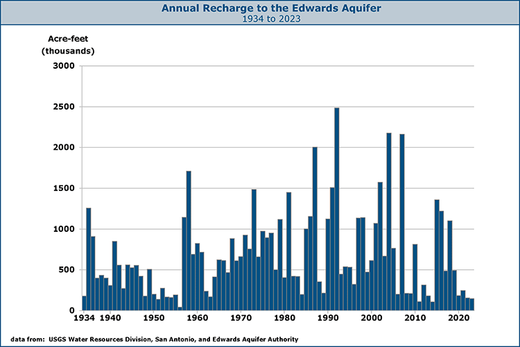
Average annual recharge for the 1934-2023 period is about 683,000 acre feet. However, averages mean little here...note how widely variable recharge can be from year to year. 2014 was the second lowest on record, with only 107,000 acre-feet of recharge. Also note how it appears that total recharge has been going up over time. It is possible that we have artificially increased the amount being recharged by pumping water out and making more room for recharge to flow in. Another possibility is that we have not been collecting good enough data for a long enough period of time to make any conclusions at all. |
|
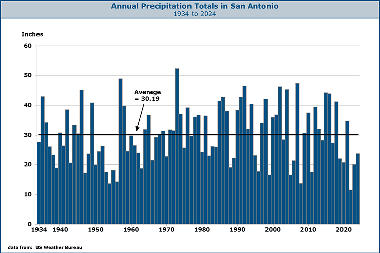
Rainfall, the only source of recharge for the aquifer, is also highly variable from year to year. Shortly after it stops raining, only small amounts of new water enter the aquifer, so there is less pressure on water already deep inside. Lower pressure means that flow at Comal and San Marcos springs is reduced, sometimes to the point where endangered species are threatened. Changes in pressure are reflected in rising or falling well levels and are monitored at the J-17 index well. |
|
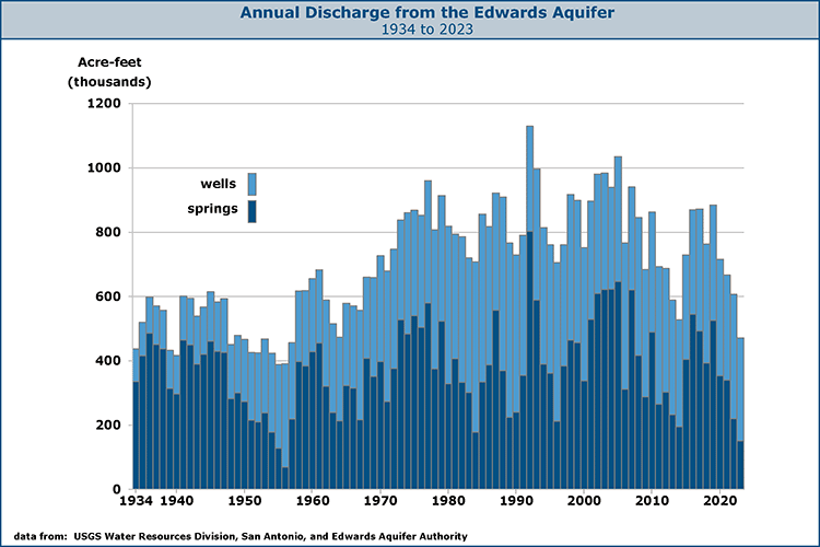
In many ways, this plot generates more questions than answers. What is immediately obvious is that total discharge appears to be increasing over time because greater amounts are being pumped from wells. The conventional wisdom is that discharge from wells decreases springflows; however, there are some years when springflows did not appear to suffer because more was being discharged from wells. Also, springflows were lowest in the 1950's when discharge from wells was only half of what it is now. This seems to suggest there is hardly anything we can do to keep springs from going dry periodically. It also points out how we are at the mercy of nature and are usually in a state of being either water-rich or water-poor, as discussed in the section on regional climate. |
|
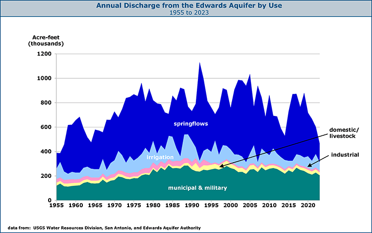
This chart shows annual discharge volumes from the
Aquifer since 1955 by type.
A few trends are evident: municipal and military uses grew steadily, peaked in
the late 80's, and have leveled off or declined somewhat since then. Livestock/domestic uses have been replaced by industrial uses. Demand for irrigation water
has declined in the last decade and varies widely depending on how much it rained that year and if the rain fell at times beneficial to farmers. Springflows also vary and in some years, such as 1991, declines in agricultural use seem to correspond to increases in springflow. |